Menus can be accessed during runtime with a special Cascading Menu block. This type of block mimics the menu structure set up in the Menu Information section of the Xephr Studio to display all of the menus and their menu entries starting with the defined menu root in a single block. Cascading menu blocks are often created on screen templates.
You can only have one cascading menu displayed per screen.
Xephr Menu Service for Standard Blocks
Requirements for Cascading Menus
In order to use cascading menus, you must have:
Styles and link styles. The only style that is used in the cascading menu is the link style assigned to the block.
Uploaded image named arrowimagemain.gif. This arrow is displayed when a menu is displayed on the top level of your cascading menu. For vertical menus, this could be an arrow pointing to the right. For horizontal menus, this could be an arrow pointing down.
Uploaded image named arrowimagesub.gif. This arrow is displayed when a menu is displayed on a sub level of your cascading menu. For vertical menus, this could be an arrow pointing down. For horizontal menus, this could be an arrow pointing to the right.
Menus defined in the Menu Information section of the Xephr Studio.
You can only have one cascading menu displayed per screen.
If you are planning on displaying different menus based on a global value assigned to users, you will need to create one cascading menu block per global value. Then, use the hide if/show if properties for the block to indicate when it's displayed.
For example, if you are using the global value MAINMENU,
and you have two types of menus to be displayed - ADMIN and USER, you
would add the global variable to each user with either ADMIN or USER assigned
as the global's value.
Then you would create two cascading menu blocks. One
you would assign the menu root of ADMIN and the other you would assign
the menu root USER.
For the ADMIN cascading menu, in the Show If property, you would enter
$$MAINMENU$$='ADMIN'.
For the USER cascading menu, in the Show if property, you would enter
$$MAINMENU$$='USER'.
You can only have one cascading menu displayed per screen.
Once you have set up a cascading menu block, the first set of menus/menu entries below the menu root will be displayed in the block, either vertically or horizontally, depending on the block set up. When you move your mouse over the menus, the entries on the menu will be displayed. When you click on a menu entry, the entity for that menu entry will be run.
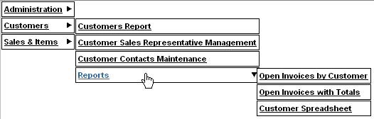
Cascading menus can be set up as floating so that when you scroll in the browser screen, the menu will remain in the same general place in the browser. For example, if you were scrolling down, the menu would remain at the top of the browser screen by jumping downward every time you scroll.
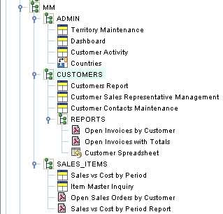
In the following examples, the menu set up looks as follows. The menu root is MM.
In this example, the arrowimagemain.gif is the arrow pointing down that is displayed at the top level, and the arrowimagesub.gif is the arrow pointing to the right on the submenu.
This cascading menu block is set up with the Vertical Cascade property set to false, and the Floating Menus property set to false.
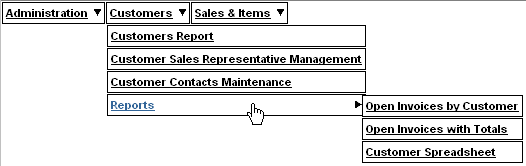
In this example, the arrowimagemain.gif is the arrow pointing to the right that is displayed at the top level, and the arrowimagesub.gif is the arrow pointing down on the submenu.
This cascading menu block is set up with the Vertical Cascade property set to true, and the Floating Menus property set to false.
Create a screen or locate an existing screen to which you wish to add a cascading menu block in the Explorer Tree.
There are options in adding the block to the screen at this point.
Right-click on the screen or template screen, hold your cursor over the Create option, and when the sub-menu is displayed, drag your cursor over the Wizard option. The final sub-menu will be displayed. Left-click on the Block option.
Left-click on the [New Block]  button in the Main Toolbar.
Left-click on the File Menu. Left-click on the New option. Left-click on the Block option.
Press Alt+B on the keyboard.
The Adding New Block screen will be displayed.
In the Create block similar to pop-list, select (none).
In the Block Name property, enter the name of the cascading menu block.
In the Block Type pop-list, select Cascading Menu.
Select the mode(s) in which this block will be displayed for this screen. There are four flags here, one for each mode - QBE, List, Edit, New. For each mode in which you wish the block to be displayed, set the flag to on. For each mode in which you do not wish the block to be displayed, set the flag to off.
Click on the Next button to continue.
Click on the Next button at the bottom right of the screen to continue.
At this point a new screen is displayed. If you wish to add another block, set the Add Block or Labels flag to on and press the Next button.
A new screen will be displayed to allow you to select whether you want to add another block to an existing block or the entity. Click on the desired object and press the Add Block button to continue to add blocks as described above.
The screen also allows you to add labels to a block. Click on the desired block and press the Add Labels button to add labels to the block as described for the Not From Query query type.
Otherwise, press the Finish button in the bottom right of the screen.
Additional modifications need to be made to the block before the cascading menu block will work.
In the Explorer Tree, locate the object for which you wish to modify a block.
Expand the Template Information object and select the template screen for which you wish to modify a block.
Expand the Group Information object and any sub-groups until you can select the screen for which you wish to modify a block.
Expand the screen and select the block that you wish to modify.
Display the block properties. These
will either be displayed in Alphabetical or Logically, depending on the
setting of the [Sort Alphabetically/Logically]  button. The following
instructions are assuming that the properties are sorted logically.
button. The following
instructions are assuming that the properties are sorted logically.
In the Name property, the name entered during block creation is displayed, and can be changed, if desired.
In the Description property, enter the user-defined description for the block.
In the Parent pop-list, if the parent of this block is another block, the parent block is displayed, grayed out. Otherwise, this pop-list is set to (entity root).
In the Type pop-list, the original setting from the block creation will be displayed, and should be set to Cascading Menu.
In the Mutability pop-list, select whether this block can be modified on screens that are created from this template. This option is ONLY available for template screens.
When set to Fully Mutable, the block is placed on all screens that inherit from this template and can be modified or deleted.
When set to Positionally Mutable, the block is placed on all screens that inherit from this template and can only be moved.
When set the Not Mutable, the block is placed on all screens that inherit from this template and cannot be modified in anyway.
In the Menu Root pop-list, select the menu name for the top level menu that will be displayed on this cascading menu block. You can only select from menus that already exist in the Menu Information section of the Xephr Studio.
Set the Vertical Cascade pop-list to the desired setting. When set to false, the menus and menu entries below the menu root will be displayed horizontally from left to right on the screen. When set to true, the menus and menu entries below the menu root will be displayed vertically from top to bottom on the screen.
Set the Floating Menus pop-list to the desired setting. When set to false, the cascading menu will remain in the same place on the screen. When set to true, the cascading menu will 'float' in the same place in the browser when you are scrolling within the browser. For example, if the cascading menu were at the top of the screen, and you scrolled down, the cascading menu block would jump down to remain at the top of the browser while you scroll.
Set the Body Style pop-list to the style to be applied to the body for this block. If set to (from parent), the style used will be the Body Style from the screen properties.
Set the Editable Field Style pop-list to the style to be applied by default to the editable fields for this block. If set to (from parent), the style used will be the Editable Field Style from the screen properties.
Set the Non- Editable Field Style pop-list to the style to be applied by default to the display only and label fields for this block. If set to (from parent), the style used will be the Non- Editable Field Style from the screen properties.
Set the Link Style pop-list to the style to be applied to hyperlinks for this block. If set to (from parent), the style used will be the Link Style from the screen properties.
In the X property, the location in pixels is displayed for the top left corner of this block or field on the X-axis (horizontal) of the layout screen. You can change this number manually, or it will be changed when you are altering the layout with the Designer Tool.
In the Y property, the location in pixels is displayed for the top left corner of this block or field on the Y-axis (vertical) of the layout screen. This value is used in conjunction with the Y Anchor Type setting. You can change this number manually, or it will be changed when you are altering the layout with the Designer Tool.
In the Y Anchor Type pop-list, select the anchor type for this block. Choices are Fixed and Relative to Block..
When set to Fixed, the upper left corner of this block will be placed a fixed number of pixels in relation to the upper left corner of the block's parent. The number of pixels is defined in the Y field for the block.
When set to Relative to Block, the upper left corner of this block will be placed a fixed number of pixels from the bottom edge of the specified block defined in the Y Anchor field. Example: if you want a particular block to appear immediately after another block which happens to be an Expandable block (and therefore you don't know where it will end on the entity).
In the Y Anchor property, select the block or field that will be used to determine the location of the block on the Y-axis. The property is only displayed when the Y Anchor Type pop-list is set to Block.
In the Width property, enter the width for the block in pixels.
In the Height property, enter the height for the block in pixels.
In the Expand Type pop-list, define the size of the block. Choices are Expandable, Fixed No Scroll Bars, and Fixed with Scroll Bars.
When set to Expandable, the block will be at least the size of the Width and Height values, but it can be larger.
When set to Fixed No Scroll Bars, the block will be the exact size defined using the Width and Height values.
When set to Fixed with Scroll Bars, the block will be the exact sized defined using the Width and Height values, but there will be a scroll bar that allows you to scroll up or down within the block or field.
Example: an address block on a report may be fixed size, while the block for the line items on an invoice will be expandable so that all line items will be visible when the report is generated.
In the Hide If property, enter the conditions under which this block will be hidden. The field will be visible on the block when the conditions are met. When an entry is made in this property, the Show If property will be hidden.
Expressions are entered in this field using formulas and are evaluated on the server side.
When the expression entered in this property evaluates to true, the field will be hidden. The evaluation of the expression occurs when the entity is generated, and not when the user is making modifications to fields on the block. (i.e. This does not "watch" user input in a field and dynamically show a block; everything is locked in when the block is first output).
Example: $$VENDOR.ACTIVE$$ = 'Y'
Hide the block if the value of the active field on the vendor block
is set to Y when the block is generated.
Example: starts-with( $$CUST_NO$$,
'NDS')
Hide the block only if the customer number starts with NDS.
The code entered in this field can
also include and/or expressions:
And is indicated by two ampersands &&
Or is indicated by two vertical lines ||
Example: ($$XEPHR_ENTITY_NAME$$='MENU')&&($$NEXTMENU$$='MM')
Hide this block if the current entity is the MENU entity and the NEXTMENU
global value is set to MM.
Example: ($$CUST_NO$$='NDS')||($$CUST_NO$$='')
Hide this block if the customer number global is set to NDS, or the
customer number global is null or doesn't exist.
In the Show If property, enter the conditions under which this block will be displayed. The block will be hidden when the conditions are met. When an entry is made in this property, the Hide If property will be hidden.
Expressions are entered in this field using formulas and are evaluated on the server side.
When the expression entered in this property evaluates to true, the field will be displayed. The evaluation of the expression occurs when the entity is generated, and not when the user is making modifications to fields on the block. (i.e. This does not "watch" user input in a field and dynamically hide a block; everything is locked in when the block is first output).
Example: $$VENDOR.ACTIVE$$ = 'N'
The block will be displayed when the value of the active field on the
vendor block is N when the entity is generated.
Example: number( $$ORDER.TOTAL$$)
= 0
Displays the block if the value of the total field on the order block
is zero.
The code entered in this field can
also include and/or expressions:
And is indicated by two ampersands &&
Or is indicated by two vertical lines ||
Example: ($$XEPHR_ENTITY_NAME$$='MENU')&&($$NEXTMENU$$='MM')
Show this block if the current entity is the MENU entity and the NEXTMENU
global value is set to MM.
Example: ($$CUST_NO$$='NDS')||($$CUST_NO$$='')
Show this block if the customer number global is set to NDS, or the
customer number global is null or doesn't exist.
In the Show if Empty pop-list, determine whether the block will be displayed when it is empty. When set to true, the block will be displayed on the screen even when it contains no data. When set to false, the block will be hidden when it contains no data.
In the Z Order property, enter a
number to define the order in which the block will be generated on the
entity. The higher the number, the later the block
will be generated. The Z order is specific to the
indention level in the entity tree, and is affected by the Y Anchor and
Anchor Type properties.
For blocks with a Tab Block as the parent block, this number determines
in which order the tabs will be displayed within the tab block.
The Created on property displays the date and time on which this block was created and cannot be changed.
The Modified on property displays the date and time on which this block was last changed and cannot be modified.
When all changes have been made,
press the [Save]  button in the Main Toolbar.