Styles define the various elements of the way something will be presented
to the user during Xephr
Styles can also be based off of other styles, inheriting all of the parent style's features, with only a few differences. This makes styles easier to maintain as you can change a property at the top level parent style, thereby changing all styles that inherit from that style as well.
User defined styles can also be set up. See User Styles.
Styles can be assigned to different levels of objects for an entity. There are three different sets of styles that are assigned at one or more of these levels: body style, link style, and field style. Body style determines the presentation of the blocks and entities. Field style determines the presentation of the fields. Link style determines the presentation of the hyperlinks.
At the field level, for display
only and label fields, styles are assigned in the Non-Editable Field Style
property, which determines the presentation of the non-editable fields.
A selection in this property, other than (from parent), will override
the Non-Editable Field Styles entered at the block, entity, and template
levels.
For editable fields, styles are
assigned in the Editable Field Style property, which determines the presentation
of the editable fields.
A select in this property, other than (from parent), will override
the Editable Field Styles entered at the block ,entity, and template levels.
For fields with type HREF, the Link
Style property is available, which determines the presentation of the
hyperlink defined by that field.
A selection in this property, other than (from parent) will override
the Link Style set at the block, entity, and template levels.
At the block level, styles are assigned in the Editable Field Style, Non-Editable Field Style, Link Style, and Body Style properties.
The Non-Editable Field Style property determines the default presentation of the display only and label fields assigned to that block.
The Editable Field Style property determines the default presentation of the editable fields assigned to that block.
The Link Style property determines the default presentation of the hyperlinks assigned to the block.
The Body Style property determines the presentation of block itself.
A selection in these properties, other than (from parent), will override the Field Style, Link Style, and Body Style properties set at the block's parent level, which is either another block or an entity.
An entry for Field Style or Link Style for a field assigned to this block will override the settings at the block level for that field or hyperlink only.
At the entity level, styles are assigned in the Editable Field Style, Non-Editable Field Style, Link Style, and Body Style properties.
The Non-Editable Field Style property determines the default presentation of the display only and label fields assigned to that entity.
The Editable Field Style property determines the default presentation of the editable fields assigned to that entity.
The Link Style property determines the default presentation of the hyperlinks assigned to blocks assigned to the entity.
The Body Style property determines the presentation of the entity itself, and determines the default presentation of the blocks assigned to the entity.
A selection in these properties, other than (from parent), will override the Field Style, Link Style, and Body Style properties set at the entity's template, defined in the Inherit's From property.
An entry for Field Style, Link Style, or Body Style for a block assigned to this entity will override the settings at the entity level for that block only.
At the template entity level, styles are assigned in the Editable Field Style, Non-Editable Field Style, Link Style, and Body Style properties.
The Non-Editable Field Style property determines the default presentation of the display only and label fields assigned to the entities that inherit from this template.
The Editable Field Style property determines the default presentation of the editable fields assigned to the entities that inherit from this template.
The Link Style property determines the default presentation of the hyperlinks assigned to blocks assigned to the entities that inherit from this template.
The Body Style property determines the presentation of the entity itself, and determines the default presentation of the blocks assigned to the entities that inherit from this template.
An entry for Field Style, Link Style, or Body Style for a entity that inherits from this template will override the settings at the entity level.
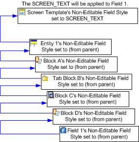
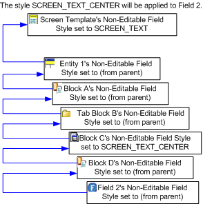
To determine from which object the style is taken, check the lowest level object first and start tracking upward. The first object that has the Style property set to something other than (from parent) determines the style that the object is using. For example:
For fields, if the Non-Editable Field Style property for the field is set to (from parent), the Non-Editable Field Style property from field's parent block will be used.
If this Non-Editable Field Style
property for the block is set to (from parent), the Non-Editable Field
Style property from the block's parent object will be used. This
may be another block or an entity.
When the parent object is a block, and the field style is (from
parent), continue checking each block's parent until you get to the entity
object.
If the Non-Editable Field Style property for entity object is set to (from parent) the Non-Editable Field Style for the entity object's template will be used. This is the Non-Editable Field Style assigned to the template entity object in the Inherit's From property.
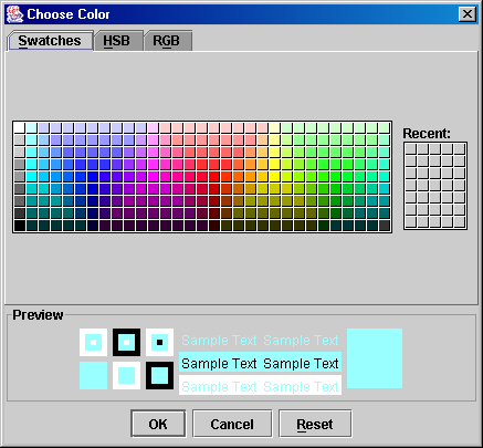
The color selector has 3 tabs that allow you to select the exact color that you want to apply to your foreground,background, or border.
The first tab is the Swatches tab. This tab displays a selection of colors from which you can select your desired color. The currently selected color is displayed in the preview pane at the bottom.
Click on a color to select it. When the desired color is selected, press the [Ok] button to return the color to the property from which the selector was opened.
Pressing the [Reset] button will reset the selected color to the one that was selected when you opened the selector.
Pressing the [Cancel] button will return you to the Xephr Studio without returning a color.
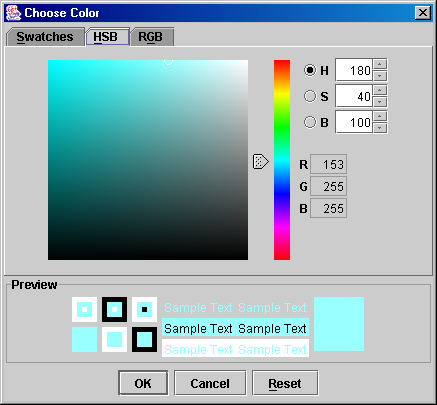
The second tab is the HSB tab. This tab displays a pallet in which you can define your desired color. The currently selected color is displayed in the preview pane at the bottom.
When the desired color has been defined, press the [Ok] button to return the color to the property from which the selector was opened.
Pressing the [Reset] button will reset the selected color to the one that was selected when you opened the selector.
Pressing the [Cancel] button will return you to the Xephr Studio without returning a color.
The HSB color model is the one that most closely resembles the human perception of color. It is made up of Hue, Saturation and Brightness. The numbers in the H,S, and B fields here define the color displayed in the preview block. The radio button selected determines the what the color pallet on the left the selector screen is displaying.
The R,G, and B fields display the red, green, and blue color values for this HSB definition. For more information on RGB colors, see the information on the RGB tab.
Hue is the wavelength of light reflected from or transmitted through an object, seen as the visible spectrum. Red, yellow, blue, and so on are the names of the hues.
When the H radio button is selected, the pallet displays the saturation and brightness choices for the hue of the color selected. The current value is indicated by the small white circle within the pallet. Using your mouse, you can move the small white circle within the pallet to change the saturation and brightness of the hue.
The color bar to the right of the pallet displays all of the hues that can be selected, with the currently selected hue indicated by the arrow to the left of the bar. Using your mouse, you can slide the arrow along the bar to select other hues.
You can also change the numeric value in the H field to modify the Hue value.
Saturation is the measure of the purity of a color or colors from 0% black to 100% for a fully saturated color.
When the S radio button is selected, the pallet displays the hue and brightness choices for the degree of saturation for the color selected. The current value is indicated by the small white circle within the pallet. Using your mouse, you can move the small white circle within the pallet to change the hue and brightness of the selected degree of saturation.
The color bar to the right of the pallet displays the degrees of saturation that can be selected, with the currently selected degree of saturation indicated by the arrow to the left of the bar. Using your mouse, you can slide the arrow along the bar to change the degree of saturation.
You can also change the numeric value in the S field to modify the Saturation value.
Brightness is the relative lightness or darkness of a color from 0% black to 100% white.
When the B radio button is selected, the pallet displays the hue and saturation choices for the degree of brightness for the color selected. The current value is indicated by the small white circle within the pallet. Using your mouse, you can move the small white circle within the pallet to change the hue and saturation of the selected degree of brightness .
The color bar to the right of the pallet displays the degrees of brightness that can be selected, with the currently selected degree of brightness indicated by the arrow to the left of the bar. Using your mouse, you can slide the arrow along the bar to change the degree of brightness.
You can also change the numeric value in the B field to modify the Brightness value.
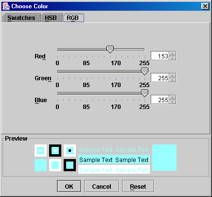
The third tab is the RGB tab. This tab displays a set of sliding numeric scales which you can use to define your color using the RGB color model. The currently defined color is displayed in the preview pane at the bottom.
When the desired color has been defined, press the [Ok] button to return the color to the property from which the selector was opened.
Pressing the [Reset] button will reset the selected color to the one that was selected when you opened the selector.
Pressing the [Cancel] button will return you to the Xephr Studio without returning a color.
The RGB color model is the color model of computers. Computer monitors and digital cameras use these colors to create all the colors seen on the monitor and saved in files. Green gives the color green, but is also used for contrast control. RGB as used on a color display monitor is also an emitted color set, which may view differently than when printed.
Red, green, and blue each have their own sliding scales to define the intensity of the color from 0 to 255. To get the color black, the values will all be set to 0 and to get the color white, the values will all be set to 255.
In the Explorer Tree, select and the Style Information object.
There are options creating a style at this point.
Right-click on the style object to which you are adding a style, and left click on the New Style option. If you are creating a new top-level style, right-click on the Style Information object.
Left-click on the [New Style]  button in the Main Toolbar.
The style will be generated and displayed in green on
the Explorer Tree. The Property Sheet will be displayed for the new style.
Style properties will either be displayed in Alphabetical or Logically,
depending on the setting of the [Sort Alphabetically/Logically]  button. The following instructions are assuming
that the properties are sorted logically.
button. The following instructions are assuming
that the properties are sorted logically.
In the Name property, enter a user-defined name for the style.
In the Description property, enter a user-defined description for the style.
The Inherits From property displays the style from which the properties the new style default. If this is a top-level style, this property displays (none). You cannot change this property, but if you wish to change the parent of a style, you can drag and drop the style object to its new parent within the Explorer Tree.
In the BG Image property, if you have an image that you wish to be displayed as the background for this style, enter the path to this image from the Xephr server.
In the Background Inherited property, select true or false to determine whether the background for the style will be inherited from the style's parent style. This property is only displayed for styles with parent styles.
In the Background property, the selected color for the background for this style is displayed. The property is displayed when the Background Inherited property is set to false or the style is a top-level style with no parent style. To change the color, double-click on the color. See the Using the Color Selector section for information on choosing your color.
In the Foreground Inherited property, select true or false to determine whether the foreground text for the style will be inherited from the style's parent style. This property is only displayed for styles with parent styles.
In the Foreground property, the selected color for the foreground text for this style is displayed. The property is displayed when the Foreground Inherited property is set to false or the style is a top-level style with no parent style. To change the color, double-click on the color. See the Using the Color Selector section for information on choosing your color.
In the Font Name property, select the name of the font that you wish to apply to the foreground text for this style. For styles with parent styles, you can set this pop-list to (from parent) to have the font determined by the parent style.
In the Font Size property, select the size of the font that you wish to apply to the foreground text for this style. The font size is defined in points. For styles with parent styles, set this pop-list to (from parent) to have the font determined by the parent style.
In the Bold property, select true or false to determine whether the foreground text for this style will be bold. For styles with parent styles, set this pop-list to (from parent) to have the setting of this property determined by the parent style.
In the Underlined property, select true or false to determine whether the foreground text for this style will be underlined. For styles with parent styles, set this pop-list to (from parent) to have the setting of this property determined by the parent style.
In the Italics property, select true or false to determine whether the foreground text for this style will be displayed in italics. For styles with parent styles, set this pop-list to (from parent) to have the setting of this property determined by the parent style.
In the H-Align property, select the horizontal alignment for the foreground text for this style. Choices are Left Justified, Centered, and Right Justified. For styles with parent styles, set this pop-list to (from parent) to have the setting of this property determined by the parent style.
In the V-Align property, select the vertical alignment for the foreground text for this style. Choices are Top Aligned, Middle Aligned, and Bottom Aligned. For styles with parent styles, set this pop-list to (from parent) to have the setting of this property determined by the parent style.
In the Border Type property, select the type of border to be applied to objects assigned this style. Choices are No Line or Solid Line. For styles with parent styles, set this pop-list to (from parent) to have the setting of this property determined by the parent style.
In the Border Color Inherited property, select true or false to determine whether the border for the style will be inherited from the style's parent style. This property is only displayed for styles with parent styles.
In the Border Color property, the selected color for the border for this style is displayed. The property is displayed when the Border Color Inherited property is set to false or the style is a top-level style with no parent style. To change the color, double-click on the color. See the Using the Color Selector section for information on choosing your color.
In the Border Size property, select the size of the border to be applied to objects assigned this style. Choices are No Border, Thin, Medium, and Thick. For styles with parent styles, set this pop-list to (from parent) to have the setting of this property determined by the parent style.
In the Created on property, the date and time on which the style was created is displayed and cannot be changed.
In the Modified on property, the date and time on which the style was last changed is displayed and cannot be changed.
When all changes have been made, press the [Save]  button on the main toolbar.
Styles have an additional selection on the right-click menu called Find Where Used. This feature allows you to view the entities, blocks, and fields on which a specific style is used.
Expand the Style Information object and expand each style until you can select the style for which you wish to view the objects that use the style.
Right click on the desired style to display the right-click
menu.
Left click on the Find Where Used option.
A screen will be displayed, showing the where-used information.
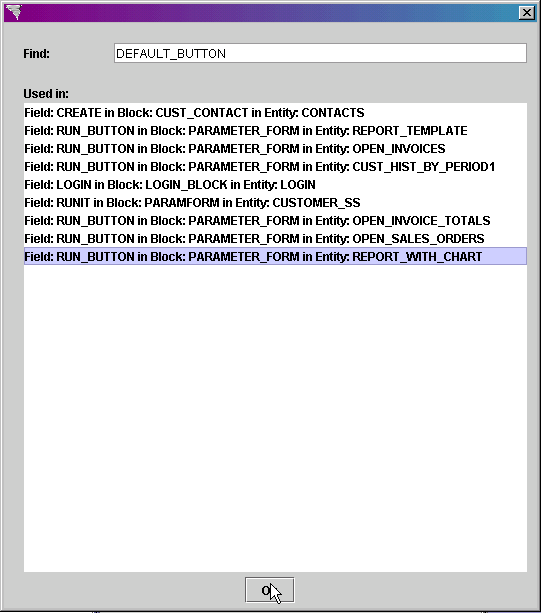
When you are done viewing the where-used information, click on the Ok button at the bottom of the screen.
Xephr is a registered trademark of NDS Systems, LC.
Copyright