Runtime menus mimic the menu hierarchy set up in the Menu Information section of the Xephr studio. When using a standard block that references the Xephr menu datasource, the root menu is defined according to a global value assigned to the user. The navigation through the menu hierarchy is then controlled by resetting that global value and refreshing the screen in the browser.
Menu Operation for Xephr Menu Standard Blocks
Creating Standard Blocks using the Xephr Menu Service
Modifying Standard Blocks that use the Xephr Menu Service
Once the menus and menu links have been created, and a menu screen has been set up with a menu block to display the menus and menu links, users can be set up to view the appropriate menus. The user must have access to the menu screen.
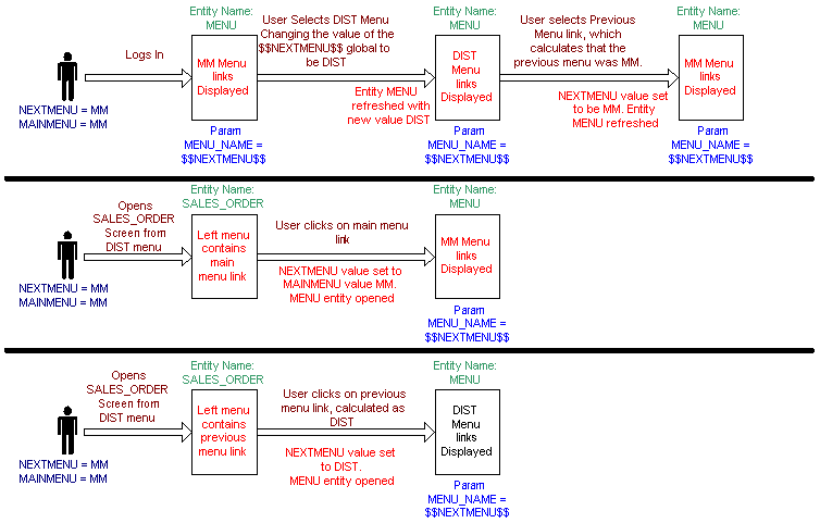
An example menu system operates as follows.
In the set of screens created, there is a main menu link on all entities that opens the menu screen. Also, on the user's properties, in the Starting Page property, the entity name for the menu screen is entered. When the user logs in, the menu screen is displayed and whenever the user goes to an entity, he/she can click on the Main Menu link on the entity to return to the menu screen.
The menu links that the user views on the menu screen is determined by the global variables assigned to the user object. The globals are NEXTMENU and MAINMENU. The menu block is set up to use the global value $$NEXTMENU$$ as the MENU_NAME parameter when the menu screen is run. This parameter changes, depending on the movements of the user through the system. Anytime a link needs to open the menu page, the $$NEXTMENU$$ global value may be different depending on the setting of the page.
For example, the user logs in with the NEXTMENU value of MM, and when the menu screen is opened the links assigned to the MM menu are displayed. The user selects one of those links, which resets the value of the NEXTMENU global variable to the new menu name. The menu screen is refreshed and displays the new menu. If the user then clicks on a previous menu link, the NEXTMENU global variable will be changed again to be the name of the previous menu for this menu, and the menu page will be refreshed displaying the previous menu.
Alternatively, the MAINMENU global never changes. When the user clicks on the Main Menu link of any screen, the NEXTMENU value is reset to be the user's main menu and the menu screen is reopened with that menu displayed.
Create a screen or locate an existing screen to which you wish to add a menu block in the Explorer Tree.
There are options in adding the block to the screen at this point.
Right-click on the screen or template screen, hold your cursor over the New option, and when the sub-menu is displayed, drag your cursor over the Wizard option. The final sub-menu will be displayed. Left-click on the Block option.
Left-click on the [New Block]  button in the Main Toolbar.
Left-click on the File Menu. Left-click on the New option. Left-click on the Block option.
Press Alt+B on the keyboard.
The Adding New Block screen will be displayed.
In the Create block similar to pop-list, select (none).
In the Block Name property, enter the name of the menu block.
In the Block Type pop-list, select Standard Block.
In the Query Type pop-list, select Xephr Service.
In the Datasource property, select the datasource set up for Xephr Menus.
In the Xephr Service property, select MenuQuery.
Set the Create Heading flag to determine if a heading will be created for this block. Set this flag to on to create a heading. Set this flag to off if no heading should be created.
Select the mode(s)
in which this block will be displayed for this screen. There
are four flags here, one for each mode - QBE, List, Edit, New. For
each mode in which you wish the block to be displayed, set the flag to
on. For
each mode in which you do not wish the block to be displayed, set the
flag to off.
It is recommended that either List or Edit mode be selected.
Set the scheme for the new block to be List.
Click the Next button in the bottom right of the screen to continue.
The Constructing Xephr Service - Menu Query screen is displayed next.
For each column, indicate whether
the column will be included as a field on this block by setting the Field
flag to on or off.
To set the Field flag for all displayed columns, left-click once on
the gray Field column header.
For each column, indicate whether
a label should be created for the field on this block by setting the Label
flag to on or off.
To set the Label flag for all displayed columns, left click once on
the gray Label column header.
You cannot set the Label flag to on
unless the Field flag is also set to on
for that column.
It is recommended that all fields be selected, but only one label.
No key is required for this block.
Click on the Next button in the bottom right of the screen to continue.
The next step is to set up the order of the columns for the block. Using the Move Up and Move Down buttons, arrange the columns to be in the order that you wish them to be displayed on the block.
It is recommended that Display Text is displayed first, followed by the other columns.
Press the Next button at the bottom right of the screen to continue.
The block has been added. Some modifications should be made to the block settings and to the fields on the block..
In the Explorer Tree, locate the menu block that you wish to modify.
Expand the Template Information object and select the template screen for which you wish to modify a block.
Expand the Group Information object and any sub-groups until you can select the screen for which you wish to modify a block.
Expand the screen and select the block that you wish to modify.
Display the block properties. These
will either be displayed in Alphabetical or Logically, depending on the
setting of the [Sort Alphabetically/Logically]  button. The following
instructions are assuming that the properties are sorted logically.
button. The following
instructions are assuming that the properties are sorted logically.
In the Name property, the name entered during block creation is displayed, and can be changed, if desired.
In the Description property, enter the user-defined description for the block.
In the Type pop-list, Standard Block is displayed and should not be changed.
In the Query Type property, Xephr Service is displayed and should not be changed.
In the Datasource property, your Xephr Menus datasource name is displayed and should not be changed.
In the Table property, the MenuQuery is displayed and should not be changed.
In the Param MENU_NAME property, enter the menu name that should be run when this menu block is displayed. This value can be a static value, such as a menu name from the Menu Information section, or it can be a variable value, such as the global value $$NEXTMENU$$. When the value is variable, the settings of the session will determine the menu displayed.
In the Max Number of Rows property,
enter the maximum number of rows that will be displayed on the screen
for this block. If this property is set to 0, the
repository default will be used from the Default Screen Row Limit set
up in the Repository Configuration.
A block is considered a list if the max number of rows is not set to
1.
Blocks are considered forms when the max number of rows is 1.
Set the On QBE pop-list to true, if this block should be included in QBE mode for this screen.
Set the On New pop-list to true, if this block should be included in New mode for this screen.
Set the On List pop-list to true, if this block should be included in List mode for this screen.
Set the On Edit pop-list to true, if this block should be included in Edit mode for this screen.
Set the Display Only pop-list to
the desired setting to indicate whether the data on this block be displayed
as text only and cannot be modified.
When this pop-list is set to true,
the data will be displayed as text only and cannot be modified.
When this pop-list is set to false,
the data will be displayed as fields by default, but field level settings
can override this.
A list is considered to be editable if the block's Display Only pop-list
is set to false.
Set the Editability pop-list to
the desired setting to indicate when this block is editable.
Always Editable: the data on this block will be displayed in form fields,
and can be modified by default. This setting can
be overridden at the field level.
Editable on New Only: the data on this block will be displayed in form
fields and can be modified when the screen is in New mode only, by default.
This setting can be overridden to Never Editable
at the field level.
Never Editable: the data on this block will be displayed in form fields,
but cannot be modified.
Set the Body Style pop-list to the style to be applied to the body for this block. If set to (from parent), the style used will be the Body Style from the screen properties.
Set the Editable Field Style pop-list to the style to be applied by default to the editable fields for this block. If set to (from parent), the style used will be the Editable Field Style from the screen properties.
Set the Non-Editable Field Style pop-list to the style to be applied by default to the display only and label fields for this block. If set to (from parent), the style used will be the Non-Editable Field Style from the screen properties.
Set the Link Style pop-list to the style to be applied to hyperlinks for this block. If set to (from parent), the style used will be the Link Style from the screen properties.
In the X property, the location in pixels is displayed for the top left corner of this block or field on the X-axis (horizontal) of the layout screen. You can change this number manually, or it will be changed when you are altering the layout with the Designer Tool.
In the Y property, the location in pixels is displayed for the top left corner of this block or field on the Y-axis (vertical) of the layout screen. This value is used in conjunction with the Y Anchor Type setting. You can change this number manually, or it will be changed when you are altering the layout with the Designer Tool.
In the Y Anchor Type pop-list, select the anchor type for this block. Choices are Fixed and Relative to Block..
When set to Fixed, the upper left corner of this block will be placed a fixed number of pixels in relation to the upper left corner of the block's parent. The number of pixels is defined in the Y field for the block.
When set to Relative to Block, the upper left corner of this block will be placed a fixed number of pixels from the bottom edge of the specified block defined in the Y Anchor field. Example: if you want a particular block to appear immediately after another block which happens to be an Expandable block (and therefore you don't know where it will end on the entity).
In the Y Anchor property, select the block or field that will be used to determine the location of the block on the Y-axis. The property is only displayed when the Y Anchor Type pop-list is set to Block or Field.
In the Width property, enter the width for the block in pixels.
In the Height property, enter the height for the block in pixels.
In the Expand Type pop-list, define the size of the block. Choices are Expandable, Fixed No Scroll Bars, and Fixed with Scroll Bars.
When set to Expandable, the block will be at least the size of the Width and Height values, but it can be larger.
When set to Fixed No Scroll Bars, the block will be the exact size defined using the Width and Height values.
When set to Fixed with Scroll Bars, the block will be the exact sized defined using the Width and Height values, but there will be a scroll bar that allows you to scroll up or down within the block or field.
Example: an address block on a report may be fixed size, while the block for the line items on an invoice will be expandable so that all line items will be visible when the report is generated.
In the Hide If property, enter the conditions under which this block will be hidden. The field will be visible on the block when the conditions are met. When an entry is made in this property, the Show If property will be hidden.
Expressions are entered in this field using formulas and are evaluated on the server side.
When the expression entered in this property evaluates to true, the field will be hidden. The evaluation of the expression occurs when the entity is generated, and not when the user is making modifications to fields on the block. (i.e. This does not "watch" user input in a field and dynamically show a block; everything is locked in when the block is first output).
Example: $$VENDOR.ACTIVE$$ = 'Y'
Hide the block if the value of the active field on the vendor block
is set to Y when the block is generated.
Example: starts-with( $$CUST_NO$$,
'NDS')
Hide the block only if the customer number starts with NDS.
The code entered in this field can
also include and/or expressions:
And is indicated by two ampersands &&
Or is indicated by two vertical lines ||
Example: ($$XEPHR_ENTITY_NAME$$='MENU')&&($$NEXTMENU$$='MM')
Hide this block if the current entity is the MENU entity and the NEXTMENU
global value is set to MM.
Example: ($$CUST_NO$$='NDS')||($$CUST_NO$$='')
Hide this block if the customer number global is set to NDS, or the
customer number global is null or doesn't exist.
In the Show If property, enter the conditions under which this block will be displayed. The block will be hidden when the conditions are met. When an entry is made in this property, the Hide If property will be hidden.
Expressions are entered in this field using formulas and are evaluated on the server side.
When the expression entered in this property evaluates to true, the field will be displayed. The evaluation of the expression occurs when the entity is generated, and not when the user is making modifications to fields on the block. (i.e. This does not "watch" user input in a field and dynamically hide a block; everything is locked in when the block is first output).
Example: $$VENDOR.ACTIVE$$ = 'N'
The block will be displayed when the value of the active field on the
vendor block is N when the entity is generated.
Example: number( $$ORDER.TOTAL$$)
= 0
Displays the block if the value of the total field on the order block
is zero.
The code entered in this field can
also include and/or expressions:
And is indicated by two ampersands &&
Or is indicated by two vertical lines ||
Example: ($$XEPHR_ENTITY_NAME$$='MENU')&&($$NEXTMENU$$='MM')
Show this block if the current entity is the MENU entity and the NEXTMENU
global value is set to MM.
Example: ($$CUST_NO$$='NDS')||($$CUST_NO$$='')
Show this block if the customer number global is set to NDS, or the
customer number global is null or doesn't exist.
In the Show if Empty pop-list, determine whether the block will be displayed when it is empty. When set to true, the block will be displayed on the screen even when it contains no data. When set to false, the block will be hidden when it contains no data.
In the Z Order property, enter a
number to define the order in which the block will be generated on the
entity. The higher the number, the later the block
will be generated. The Z order is specific to the
indention level in the entity tree, and is affected by the Y Anchor and
Anchor Type properties.
For blocks with a Tab Block as the parent block, this number determines
in which order the tabs will be displayed within the tab block.
In the Commit Order property, enter a number to define the order in which the data in the block will be committed when the record is saved. The higher the number, the later the block will be saved.
The Created on property displays the date and time on which this block was created and cannot be changed.
The Modified on property displays the date and time on which this block was last changed and cannot be modified.
When all changes have been made,
press the [Save]  button in the Main Toolbar.
Make any layout changes with the Designer Tool.
The final changes for this menu include hiding the fields that you do not need to see and creating the link that actually runs the menu. The following instructions assume that you are using a global value to determine the menu that is displayed and that the global is called NEXTMENU. This value should have been entered in the block's Param MENU_NAME property as $$NEXTMENU$$.
In the Explorer Tree, find the DISPLAY_TEXT field and display the property sheet.
In the Hyperlink To property, enter the following text.
This code says that if the target_is_menu field for the record is Y,
when the user clicks on the link, reopen the menu screen with displaying
the new menu, otherwise, if the new_page field for the record is set to
Y, when the user clicks on the link, open the entity in a new screen in
its default mode. Otherwise, open the entity in
this screen, in its default mode. Replace <your menu entity name> with
the name of the entity containing the menu.
if ( $$.TARGET_IS_MENU$$ == 'Y')
{
SetGlobalValue( 'NEXTMENU', $$.ACTION_NAME$$);
Show( '<your menu entity name>');
}
else
{
if ( $$.NEW_PAGE$$ == 'Y')
{
ShowInWindow($$.ACTION_NAME$$, $$.MODE$$, '600', '800', '0', '0');
}
else
{
ExecuteShow($$.MODE$$,$$.ACTION_NAME$$);
}
}
Find the label that you created when you created the block and modify its text as desired.
In the menu block (where the DISPLAY_TEXT field is), hold down the shift key on the keyboard and click on the remaining fields to select them.
Display the multi-select property sheet and set the Visible property to false. We do not need to display any of these fields on the screen.
Make any additional field or layout changes.
Click on the Save
button in the main toolbar to save the changes.
Xephr is a registered trademark of NDS Systems, LC.
Copyright