 QBE
Column SelectorQBE
Column Selector
QBE
Column SelectorQBE
Column SelectorQBE blocks can be set up to allow the user to select the columns that will be displayed on the list block when a query is performed. The column selector is a field object that can be added to a QBE block. This feature works very well with QBE/List combination blocks.
The following rules apply for the list block:
The header block must have a Z order of 1. The header block is the block that contains the labels.
The database block must have a Z order of 2. The database block is the block that is mapped to a database table or view/
All non database fields in the database block will always be output. You will want to have one of these set up as the link to the screen in edit mode, if applicable.
There must be exactly one label in the header block for each field in the database block. They will need to have the same Z order, but they can be hidden (visible property set to false) if you do not want them to be visible on the list block.
The database block must not wrap, i.e. all of the fields in the database block must have the same Y value.
The database block must not repeat horizontally.
The spacing between the labels and fields is calculated as:
The X value for the database field with the lowest Z order is determined.
The length of the database field is added to determine the ending X value of the field.
The X value for the database field with the next lowest Z order is determined.
The difference between the ending X value of the first field and the X value of the second field will be the number of pixels that separate all of the fields. Ordering your fields during runtime will not affect this.
For example, if your first field starts at X:0 and has a length of 50, and your second field starts at 55, there will be a 5 pixel difference between all of your fields in the list block. 0+50= 50. 55-50 = 5.
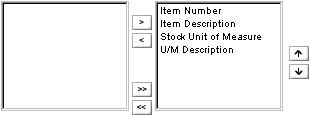
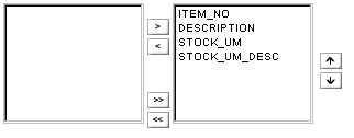
This image is an example of the column selector object.
The left side of the column selector lists the names of the fields that are available to be selected for display on the list block. If the list block fields have been assigned tool tips, the tool tip text will be displayed instead of the column name.
The right side lists the names for the fields that have been selected for display on the list block.
To include a field on the list block, click on the field
in the left side and press the  button. The field
will be moved from the left side (available) to the right side (selected).
button. The field
will be moved from the left side (available) to the right side (selected).
To include all fields on the list block, press the  button. All fields will be moved from the left
side (available) to the right side (selected).
button. All fields will be moved from the left
side (available) to the right side (selected).
To remove a field from the list block, click on it on
the right side and press the  button. The field
will be moved from the right side (selected) to the left side (available).
button. The field
will be moved from the right side (selected) to the left side (available).
To remove all fields from the list block, press the
 button. All fields will be moved from the right
side (selected) to the left side (available).
button. All fields will be moved from the right
side (selected) to the left side (available).
Fields marked as visible on the list block are displayed on the right side (selected) automatically. Fields marked as invisible on the list block are displayed on the left side (available) automatically.
Fields will the Suppress on CSO property set to true will not be included in the column selector and will be hidden or displayed on the list block in accordance with their property settings.
You can order the fields using the up and down arrows on the far right.
To move a field up in the ordering, click on the field
name and press the  button. The field will be moved
up in the list order.
button. The field will be moved
up in the list order.
To move a field down in the ordering, click on the field
name and press the  button. The field will be moved
down in the list order.
button. The field will be moved
down in the list order.
When all fields have been selected and ordered, press the button or link the executes the search on the QBE block. The list screen is displayed with only the selected fields in the selected order. Fields that were not selected and their labels will not be displayed on the list screen.
In the Explorer Tree, locate the object to which you wish to add the column selector.
Expand the Template Information object, locate the desired template and expand it, and then locate the QBE block to which you wish to add the column selector.
Expand the Group Information object and any sub-groups until you can select the desired entity and expand it. Then locate the QBE block to which you wish to add the column selector.
Add a Label to the QBE block.
Save the block.
Expand the block and select the newly added label. Display the property sheet for the label.
In the Display As property, select QBE Column Selector.
In the Field Style pop-list, select the style to be used for the column selector on this screen. If set to (from parent), the default field style for the block will be used.
In the X property, enter the location in pixels of the top left corner of the column selector on the X-axis (horizontal) of the layout screen. You can change this here, or it will be changed when you move the column selector with the Designer Tool.
In the Y property, enter the location in pixels of the top left corner of the column selector on the Y-axis (vertical) of the layout screen. This value is used in conjunction with the Y Anchor Type setting. You can change this number manually, or it will be changed when you are altering the layout with the Designer Tool.
In the Y Anchor Type pop-list, select
the container for the column selector . Choices
are Fixed and Relative to Field.
When set to Fixed, the upper left corner of this field will be placed
a fixed number of pixels in relation to the upper left corner of the field's
parent. The number of pixels is defined in the
Y field for the block.
When set to Relative to Field, the upper left corner of this field
will be placed a fixed number of pixels from the bottom edge of the specified
field defined in the Y Anchor field.
In the Y Anchor property, select the field that will be used to determine the location of the field on the Y-axis. The property is only displayed when the Y Anchor Type pop-list is set to Relative to Field.
In the Width property, enter the width of the field in pixels.
In the Height property, enter the height of the field in pixels.
The Expand Type pop-list is set to Fixed No Scroll Bars and cannot be changed. The column selector will be the exact size defined using the Width and Height values.
In the Z Order property, enter the
order in which the column selector will be displayed in comparison with
the other fields on the block.
At this time, Z order only affects fields when they overlap one another.
For example, if you had 2 fields of the same size
in the same location on the block, one with a Z order of 1, and the other
with a Z order of 2, the one with the Z order of 2 will be displayed because
it was generated last.
The Created on property displays the date and time on which the column selector was created and cannot be changed.
The Modified on property displays the date and time on which the column selector was last changed, and cannot be modified.
Press the [Save]  button to save the changes.
Right click on the screen entity and select Designer Frame to display the Designer Tool.
The column selector fields starts
out the same size as any other field, but it needs to be larger to accommodate
the functionality. In the Designer Tool, enlarge
the field containing the column selector until you can see all of the
buttons and the entire length of the field names when you run the block.
Some changes are also needed for the list block.
If your screen has an edit mode,
make sure you add
a label and create
a hyperlink that links to the screen in edit mode.
The default for list mode during block creation is
that the first column on the list is assigned the link to the screen in
edit mode, passing the primary keys. For screens
using the column selector, this will not work because the user may not
select that field.
In the Designer Tool, display the screen in List Mode.
For each field in the database block,
in the Tool Tip property, enter the text that you want to be displayed
for that field in the column selector. For example,
you might want the text to read Item Number instead of the field name
of ITEM_NO. If there is a tool tip entered for
the field, that text will be displayed instead.
For all fields that you want selected automatically (placed on the right side of the selector), verify that the Visible property for both the label and the field is set to true.
For all fields that you want available, but not selected (placed on the left side of the selector), set the Visible property for both the label and the field to false.
For all fields that you want included in the list block, but not available to be selected or selected automatically, set the Suppress on CSO property to true. When this flag is set to true, the field will not be included in the column selector, and will be displayed or hidden on the list block according to the field properties.
Line up the fields and labels on
the list in the order of the Z orders assigned to them. The
one with the lowest Z order should go on the far left. The
one with the next lowest Z order should be placed to the right of that
with the desired space between them The space between
the end of the first field and the beginning of the second field is what
determines the default space between all of the fields.
If you have an edit screen, the link label field for navigating to
that field should be placed first. That way it
will always be displayed in the same place.
Stack all of the remaining database fields on top of the second field. When the list screen is generated, it will determine where the fields will be placed and in what order.
Press the [Save] button to save the changes.