 Chart
BlocksChart
Blocks
Chart
BlocksChart
BlocksChart blocks can be added to reports or screens. The charts are generated from datapoint values and datapoint labels assigned to columns selected for the block.
Many different types of charts can be created in Xephr
In the following examples, the chart block has been set up with two datapoint value columns - sales revenue this year and sales cost this year. The datapoint label is sales representative.
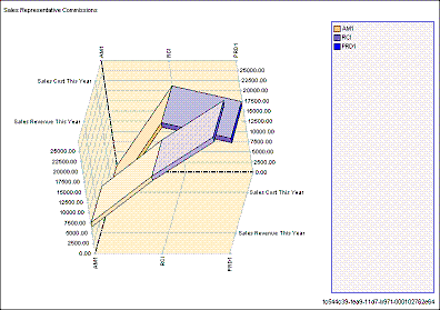
Needs one or more datapoint values and one datapoint label.
There is a set of points for each datapoint value column.
Each point on the chart is placed at the database value in the datapoint value column for the datapoint label record.
In the example, there are two sets of points, one for sales cost and one for sales revenue.
Within the sales cost set, there is one point placed on the chart at the numeric value for the sales cost in the sales representative record.
Within the sales revenue set, there is one point placed on the chart at the numeric value for the sales revenue in the sales representative record.
These points are connected and the areas between colored in.
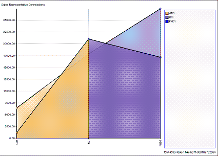
Needs one or more datapoint values and one datapoint label.
There is a set of vertical lines for each datapoint value column.
Each vertical line on the chart is placed at the database value in the datapoint value column for the datapoint label record.
In the example, there are two sets of vertical lines, one for sales cost and one for sales revenue.
Within the sales cost set, there is one line placed on the chart at the numeric value for the sales cost in the sales representative record.
Within the sales revenue set, there is one line placed on the chart at the numeric value for the sales revenue in the sales representative record.
These lines are connected and the areas between colored in.
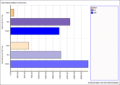
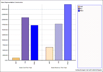
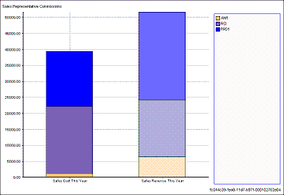
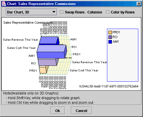
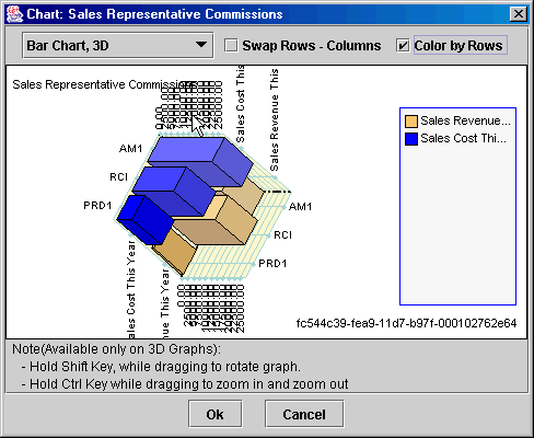
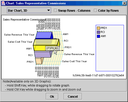
Needs one or more datapoint values and one datapoint label.
There is a set of bars for each datapoint value column.
Each bar on the chart ends at the database value in the datapoint value column for the datapoint label record.
In the example, there are two sets of bars, one for sales cost and one for sales revenue.
Within the sales cost set, there is one bar placed on the chart ending at the numeric value for the sales cost in the sales representative record.
Within the sales revenue set, there is one bar placed on the chart ending at the numeric value for the sales revenue in the sales representative record.
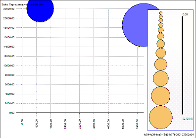
Needs one or more datapoint values and one datapoint label that represents a single database record.
In this example, the bubble chart is displaying one bubble for each datapoint value for the last record (database label) in the database query. Since this chart only displays data for one record, all other records returned by the database query are ignored.
One of the bubbles is the sales cost for the sales representative and one is the sales revenue for the last sales representative record in the query.
The bubbles are sized proportionately to their datapoint value.
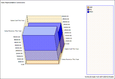
Needs 5 datapoint values and one datapoint label. One of the datapoint values needs to be a date.
There is a set of bars for each datapoint value column.
Each column on the chart ends at the database value in the datapoint value column for the datapoint label record.
In the example, there are two sets of columns, one for sales cost and one for sales revenue.
Within the sales cost set, there is one column placed on the chart ending at the numeric value for the sales cost in the sales representative record.
Within the sales revenue set, there is one column placed on the chart ending at the numeric value for the sales revenue in the sales representative record.
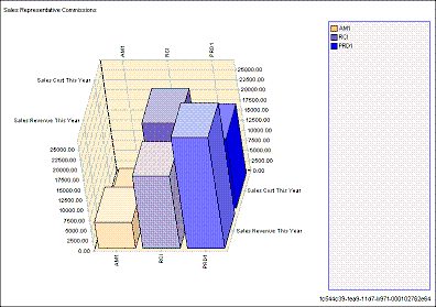
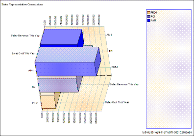
Needs one or more datapoint values and one datapoint label.
Each column on the chart ends at the database value in the datapoint value column for the datapoint label record.
In the example, there are two sets of columns, one for sales cost and one for sales revenue.
Within the sales cost set, there is one column placed on the chart ending at the numeric value for the sales cost in the sales representative record.
Within the sales revenue set, there is one column placed on the chart ending at the numeric value for the sales revenue in the sales representative record.
Needs one or more datapoint value and one datapoint label.
The heat map is split into sections for each datapoint value column and each datapoint value label. The color range indicates the database vales in the datapoint value column for the datapoint label record. The color blends from one section to the next.
In the example, the top of the chart is the starting point for the sales cost, and the bottom of the chart is the starting point of the sales revenue. Each vertical line in the chart represents a sales representative. The color starting on each line indicates the database value for that datapoint label record. The color blends outward from each line to display a flow between each sales representative and between sales cost and sales revenue.
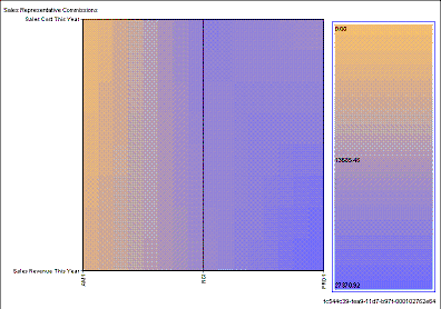
Needs one or more datapoint values and one datapoint label.
The heat map is split into sections for each datapoint value column and each datapoint value label. The color range indicates the database vales in the datapoint value column for the datapoint label record. The color blends from one section to the next.
In the example, the rear part of the chart is the starting point for the sales cost, and the front part of the chart is the starting point of the sales revenue. Each vertical line in the chart represents a sales representative. The color starting on each line indicates the database value for that datapoint label record. The color blends outward from each line to display a flow between each sales representative and between sales cost and sales revenue.
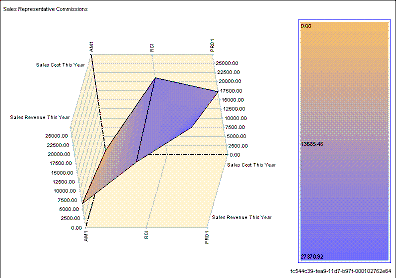
Needs one or more datapoint values and one datapoint label.
There is a set of points for each datapoint value column.
Each point on the chart is placed at the database value in the datapoint value column for the datapoint label record.
In the example, there are two sets of points, one for sales cost and one for sales revenue.
Within the sales cost set, there is one point placed on the chart at the numeric value for the sales cost in the sales representative record.
Within the sales revenue set, there is one point placed on the chart at the numeric value for the sales revenue in the sales representative record.
These points are connected by a line.
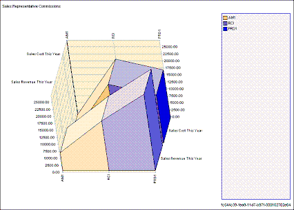
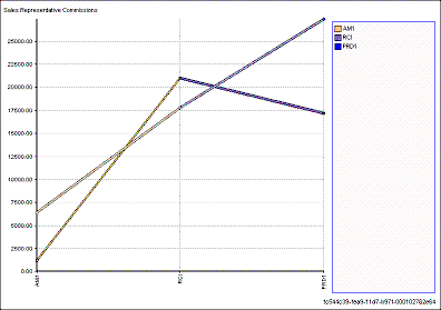
Needs one or more datapoint values and one datapoint label.
There is a set of points for each datapoint value column.
Each point on the chart is placed at the database value in the datapoint value column for the datapoint label record.
In the example, there are two sets of points, one for sales cost and one for sales revenue.
Within the sales cost set, there is one point placed on the chart at the numeric value for the sales cost in the sales representative record.
Within the sales revenue set, there is one point placed on the chart at the numeric value for the sales revenue in the sales representative record.
These points are connected by a plane.
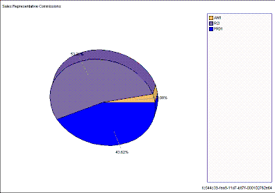
Needs one datapoint value and one datapoint label.
Each section in this chart represents a datapoint label record. The amount of space taken up in the pie is determined by the database value for the datapoint value column for the datapoint label record.
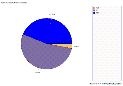
Needs one datapoint value and one datapoint label.
Each section in this chart represents a datapoint label record. The amount of space taken up in the pie is determined by the database value for the datapoint value column for the datapoint label record.
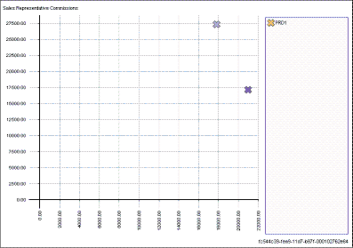
Needs one or more datapoint values and one datapoint label where the datapoint label is one record.
In this example, the scatter chart is displaying one X for each datapoint value for the last record (database label) in the database query. Since this chart only displays data for one record, all other records returned by the database query are ignored.
One of the X's is placed at the numeric sales cost for the sales representative and one is the sales revenue for the last sales representative record in the query.
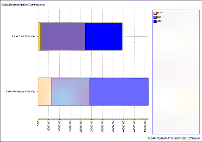
Needs one or more datapoint values and one datapoint label.
There is a set of bars for each datapoint value column.
Each bar on the chart equals the total amount of the database value in the datapoint value column for the datapoint label record. Each bar begins where the last bar ended.
In the example, there are two sets of bars, one for sales cost and one for sales revenue.
Within the sales cost set, the first bar in the set is the total sales cost amount for the first sales representative. The second bar, representing the total sales amount cost for the second sales representative, begins where the first bar stopped. The third bar, representing the total sales amount cost for the third sales representative, begins where the second bar stopped.
Within the sales revenue set, the first bar in the set is the total sales revenue amount for the first sales representative. The second bar, representing the total sales amount revenue for the second sales representative, begins where the first bar stopped. The third bar, representing the total sales amount revenue for the third sales representative, begins where the second bar stopped.
Needs one or more datapoint value and one datapoint label.
There is a set of bars for each datapoint value column.
Each bar on the chart equals the total amount of the database value in the datapoint value column for the datapoint label record. Each bar begins where the last bar ended.
In the example, there are two sets of bars, one for sales cost and one for sales revenue.
Within the sales cost set, the first bar in the set is the total sales cost amount for the first sales representative. The second bar, representing the total sales amount cost for the second sales representative, begins where the first bar stopped. The third bar, representing the total sales amount cost for the third sales representative, begins where the second bar stopped.
Within the sales revenue set, the first bar in the set is the total sales revenue amount for the first sales representative. The second bar, representing the total sales amount revenue for the second sales representative, begins where the first bar stopped. The third bar, representing the total sales amount revenue for the third sales representative, begins where the second bar stopped.
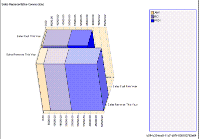
Needs one or more datapoint values and one datapoint label.
There is a set of columns for each datapoint value column.
Each column on the chart equals the total amount of the database value in the datapoint value column for the datapoint label record. Each column begins where the last bar ended.
In the example, there are two sets of columns, one for sales cost and one for sales revenue.
Within the sales cost set, the first column in the set is the total sales cost amount for the first sales representative. The second column, representing the total sales amount cost for the second sales representative, begins where the first column stopped. The third column, representing the total sales amount cost for the third sales representative, begins where the second column stopped.
Within the sales revenue set, the first column in the set is the total sales revenue amount for the first sales representative. The second column, representing the total sales amount revenue for the second sales representative, begins where the first column stopped. The third column, representing the total sales amount revenue for the third sales representative, begins where the second column stopped.
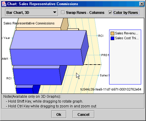
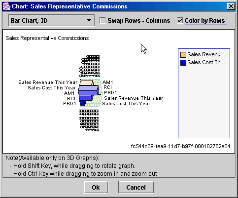
When a chart block is set up on a screen, you can view different chart types for the same information using the chart preview tool. To open the chart preview tool, double click on the chart.
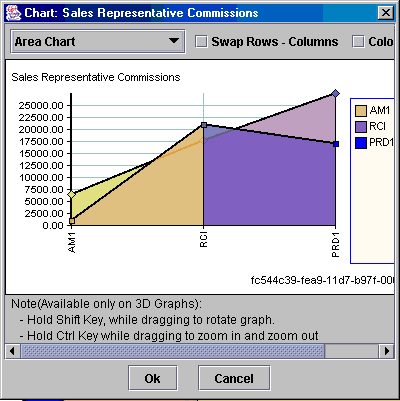
The chart preview tool opens displaying the information in the chart on your screen in the chart's assigned type. You can change the size of the preview tool by left clicking on the corner of the window with your cursor and dragging the corner outward.
To change the chart type being displayed, select a new chart type in the pop-list on the top-left of the chart.
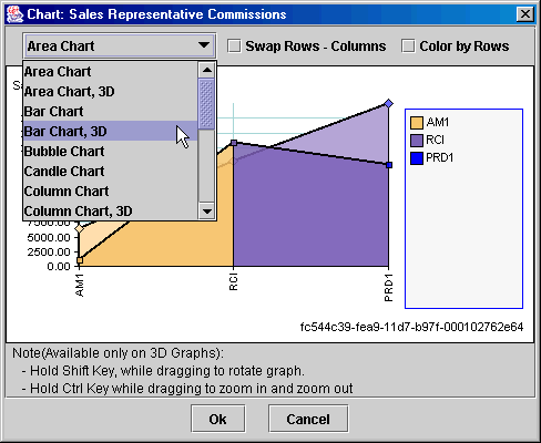
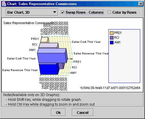
The Swap Rows-Columns checkbox setting changes where the columns and rows are displayed on the chart. The display differs for each chart type.
The Color by Rows checkbox setting changes the coloring of the data displayed. When set to on, the previewer colors the data according to the datapoint label records. When set to off, the previewer colors the data according to the datapoint values.
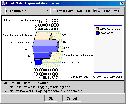
Three dimensional graphs can be rotated or zoomed in/out.
To rotate the graph, hold down the shift key, click on the graph, and drag the mouse.
To zoom in on the graph, hold down the ctrl key, click on the graph, and drag the mouse down.
To zoom out in the graph, hold down the ctrl key, click on the graph, and drag the mouse up.
To view the value of a column or row, hold your mouse over that column/row and the value will be displayed.
Xephr is a registered trademark of NDS Systems, LC.
Copyright