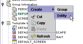
Select the Group Information object. Expand it, and select the group to which you wish to add the new report entity.
Right click on the group and select
Create ->Entity.
Click on the Report
bullet.
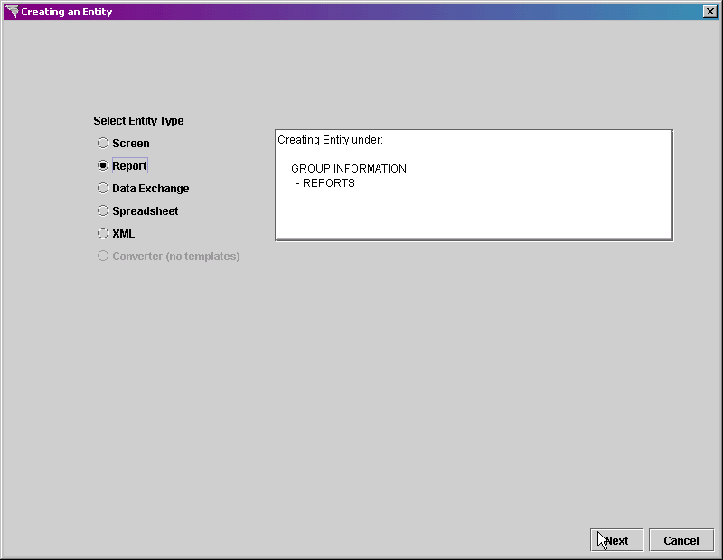
Click on the Next button at the bottom right of the screen.
In the Entity Name property, type REPORT_WITH_CHART as the entity name.
Leave the Datasource
property set to (use default), since there is only one datasource for
the Xephr
In the Based On property, select REPORT_TEMPLATE, which is the template that we created earlier.
Set the Default Mode property to Run Report.
Leave the Body Style, Editable Field Style, Non - Editable Field Style, Lov Style, and Link Style set to (from parent).
Leave the Document
Security set to Not Secure.

Click on the Next button at the bottom right of the screen.
In the Block Name property, enter CUST_HIST as the name of the block.
In the Block Type property, select Chart Block.
Set the Query Type property to Complex Query.
Leave the Datasource property set to (use parent).
In the Chart Type pop-list, select Bar Chart.
In the Chart Title property, enter Sales vs Cost.
Leave the Create
Heading property set to off.

Click on the Next button at the bottom right of the screen.
The Setting Complex Query properties screen is displayed.
When the Query Type is Complex Query for any block, you must enter the select statement, filters, and ordering and grouping information manually, defining the columns to be selected and the table from which the columns will be selected.
In the Select
Statement property, enter
select year_month, sum(sls_cost) sls_cost, sum(sls_rev) sls_rev from
cust_hist_mo_dtl
In the Filters
property, to have only periods from 2003 displayed, enter
where year_month like '2003%'
In the Ordering
and Grouping property, enter
group by year_month
order by year_month

Click on the Next button on the bottom right of the screen to continue.
The Adding Fields screen is displayed, including the columns defined in the complex query. Select the columns that you wish to include in the chart.
For charts, to include a column in the chart, set the Key checkbox to on. Do this for all columns displayed.
For each column, in the Used
As property, you must define how the column will be used when generating
the chart.
For the YEAR_MONTH column, select Datapoint
Label. This is the column that is the key
to the chart, for which the values are measured. The
values in this column are used to label each bar.
For the SLS_COST and SLS_REV columns, select Datapoint
Value. These are the measured values
that determine the height of the bars.

Click on the Next button at the bottom right of the screen.
The Option
to Add More screen is displayed. We do not
need to add any additional blocks. so click on the Finish
button.

The new entity is added to the initially selected group.

Click on the Save  button in the main toolbar to save the new report entity.
In the Explorer Tree, left click on the REPORT_WITH_CHART report entity and display the property sheet.
In the Title
property, enter the title for this report - Sales vs Cost by Period.

All other settings come from the report template.
Expand the HEADER_BLOCK block next, select the HEADER_TEXT field, and display the property sheet.
In the Contents
property, enter the name of the new report - Sales vs Cost by Period.

Click on the Save
button in the main toolbar to save the changes.
Right click on the CUST_HIST block and select Designer Frame from the menu.

Expand the Designer Tool to display the entire report.
Notice that the report title is too small to display
all of the words. Left click on the field to select
it. Then, hold your cursor over the right edge
of the field until it turns into a double headed arrow. Left
click, hold down the mouse button, and drag the edge to the right until
the field displays all the words.


The CUST_HIST block needs to be expanded a little so
that it will display the chart properly. Left click
on the block to select it. In the same way as you
expanded the report title, we are going to expand this block. Hold
your cursor over the bottom edge of the chart until it turns into a double-headed
arrow. Left click, hold down the mouse button,
and drag the edge down until it looks like it's big enough.


Click on the Save
button in the main toolbar to save the changes.
To test the new report entity, highlight it by selecting
it in the Explorer Tree, and click on the Run
 button in the main toolbar.
The Preparing to Run pop-up screen is displayed. Click
on the Run button.

The report is generated and displayed on the screen.